Re-building this blog
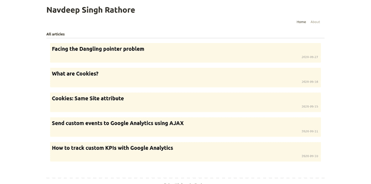
This story is about how I made my blog go from this
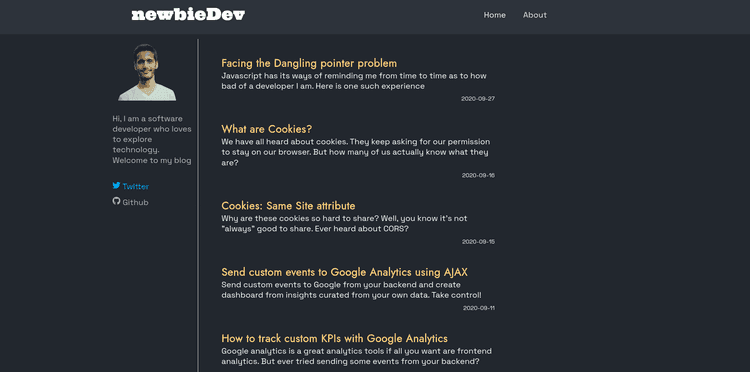
to this
Why build it anyway?
Why build a blog from scratch when I could easily use sites like Wordpress or Tumblr and get a great theme and just write stuff? Or maybe just use medium or dev.to?
Although the previous version of this blog was just an attempt to learn gatsby and see what the hype is all about, the idea of building a blog from scratch has been in my head since I first ever wrote html.
I love to write articles and share my experiences and learnings. Wanted a place I could call mine. Some place without ads. And one thing was for sure... it should have a dark mode 👓
Now that that's out of the way, Let me take you through the journey I was on for the past few weeks.
Building everything 🛠
I just want to put it out there - ALL THE STYLING ON THIS BLOG IS CUSTOM CSS. I never thought I would spend my time writing css for any project, but it was fun (not that I would ever do it again). It helped me learn a lot and brush up old skills.
Earlier, I would use flexbox for everything. Mainly because it was easy to wrap my head around and you could build 80% of all you will ever need using display:flex. But with the expectations I had with the new look, implementing flexbox was just a waste of time. I Learnt about sticky positions.
Also, I used SAAS and SCSS rather than pure just CSS (Why? Wanted to work with it. Just curious). Helped organise the code a lot better (Not that I would call writing css coding).
And the plugins. Most of the previous one's were sufficient to get the site running, but I added some for image optimisation, one for syntax highlighting on code blocks and also added analytics. Now I can track how often you read my site.😁
And that was it for development since most of the core functionalities were already implemented in the previous site.
The design 🖌
This was the hardest part. I am not a designer in any way, but so far, I like what I built. Let's see how I was inspired for each and every part of this blog (obviously the design isn't original... duh!!)
Layout
The layout was supposed to give the content the main focus but at the same time give room for future improvements and additions. The content in the center with nothing on the sides like here felt to solve the purpose but I could not manage to get the space on the sides right 🤷🏻. Also, after I built it, it felt too empty.
So I decided to have a side info bar as well as a sticy navbar when reading the blogs. I might later change the card on the left to be sort of a table of contents tree, so that it is easier to navigate through long articles (i.e. if I do write those some day 🤞). But other than that I am happy with what I have right now.
But for the home screen, I wanted to show everything (you can clearly see how bad I am at web design). So I took inspiration from one of my favourite bloggers - Vickie Li. The only difference now, is that she has absolutely awesome content on her site. 😅
Colours 🎨
As mentioned, the blog was supposed to have a dark theme. I loved the improvements that github did with there dark theme and decided to copy from there for the background and font colour. 😎 For the headings, I had decided this way back that I would build something like Tania Rascia's blog. I am not proud that I am copied all this but... ehh!
Side note: Tania Rascia's blog is a gold mine! I have learnt a lot about React Development from there and it was one of the early inspirations to build my blog. You might even notice that I added a similar footer as the one found on her blog. I learnt gatsby just because she mentioned that her blog is built using that. Little did I know, it takes a lot more than just an SSG to build an outstanding blog like her's
Fonts 🆒
I was not actively searching for these, but I kept collecting colour palettes and fonts that caught my eye while browsing through the web.
I used Space Grotesk for the main content and Jost for the headings. I found these after I got amazed by the typography while reading this article (sometimes I think I focus on the wrong things at the wrong times)
Thanks to the creators Owen Earl and Florian Karsten. I don't know these guys in any way but just look at the typeface!
Concluding
I hosted this on Netlify using an old domain that I purchased a long time ago (for something completely different). I would had preferred a domain that had nsrcodes, but, it's a start.
I love the way the blog looks now, and will probably spend more time writing good articles. Did you like the new design? Or did you hate it?
Will probably work on a way to make it easier to get in touch with you, maybe an email list or a comment section. But till then reach out to me on twitter with your thoughts and suggentions.
😃


